
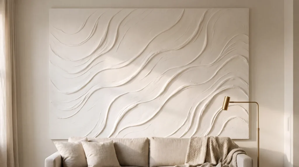
A beautiful piece of neutral textured wall art can still fall flat if it’s styled badly. Hung on a dim wall, lit from straight ahead or crowded by small frames, even rich impasto texture can look ordinary, and the room still feels cold.
Styling is what lets the texture do its job. Scale, placement, side lighting and the materials around the piece all change how its ridges catch the light. These 15 ideas cover each of those, room by room, so your neutral textured art looks intentional wherever you hang it.
Key Takeaways
- Get the scale right. A small canvas on a large wall can look accidental. Aim for at least two-thirds of the width of the furniture below it.
- Light it from the side. Flat lighting hides 3D texture; light that skims across the surface reveals it.
- Contrast the materials. Pair chalky textured canvas with smooth materials like marble, raw oak or velvet for a balanced, interesting look.
- Frame it. A raw wood floater frame makes a simple canvas look gallery-ready.
Getting the Scale Right
1. Above the Bed
The wall above your bed is a great spot for one large piece of minimalist textured canvas art, which grounds the whole room. Hang the bottom edge about six inches above the headboard so the art and bed read as one unit rather than the art drifting up toward the ceiling.
2. Over the Dining Room Credenza
Dining rooms often have lots of hard surfaces, like wood tables, metal chairs and glass light fittings. A ribbed plaster piece above the buffet softens all those hard lines, and its gentle waves help take the edge off echoes.

3. Beside the Bathroom Vanity
Bathrooms often feel cold, with all that tile and glass. One simple fix is to lean a small, textured piece on the vanity, resting against the mirror. It’s an unexpected spot, and it adds instant warmth while softening the room’s hard lines.
4. At the End of a Hallway
A long hallway feels better with something to walk toward. A piece of beige plaster art at the far end catches light from nearby rooms, draws the eye forward and makes a narrow hallway feel more open.
Lighting Your Textured Art
5. Light It With Wall Sconces
Texture needs shadow. Under flat overhead downlights, the ridges almost disappear. A pair of brass wall sconces on either side washes light across the surface, casting long shadows that shift as the evening goes on.
6. Use Afternoon Sunlight
Before you put up a single nail, notice where the natural light falls in the room.

Look at where the afternoon sun lands on your walls. Art hung where the light moves across it changes through the day, looking quite different at 9 a.m. than at 4 p.m.
7. Add a Picture Light
If the spot doesn’t get much natural light, a picture light makes a big difference. Mount a slim brass picture light above the frame and angle it slightly inward. The warm, downward light brings out every ridge and brushstroke.
8. Avoid Cool 4000K Bulbs
Bulb color matters more than you might expect. Cool, bluish 4000K bulbs can turn warm creams and beiges a flat, chilly gray, so choose warm 2700K bulbs to bring out the creamy undertones of the canvas.
Choosing Materials
9. Look for Heavy Impasto
When you buy a ready-made piece, look for the word impasto, which means the paint or plaster is applied thickly enough to stand up from the surface. Real impasto has a heavy, stone-like quality that looks expensive.

10. Try Raw Linen and Ribbed Silk
Texture doesn’t have to mean plaster. A large frame wrapped in nubby, unbleached linen gives a softer, more refined backdrop that still feels deliberate and stylish.
11. Buy From Small Artisan Shops
Mass-produced prints that imitate 3D ridges tend to look flat in person. Look for independent makers who work with real clay, limestone or heavy acrylics instead, so the piece has genuine texture and weight.
12. What to Know About DIY Modeling Paste
If you’re trying a DIY textured canvas, skip drywall joint compound. It’s made for rigid walls and tends to crack as a flexible canvas moves with changes in humidity.

Flexible acrylic modeling paste is a better choice. It costs a little more, but it dries slightly flexible, so it’s far less likely to crack, even if you move house.
Bringing It All Together
13. Float It in Raw Oak
Unfinished canvas edges can make a piece look incomplete. A floater frame in oak leaves a quarter-inch gap around the canvas, creating a dark shadow line that makes the art look as if it’s floating, and gives it a polished, gallery finish.
14. Skip the Frame for a Raw Look
There’s one exception to the framing advice: in a home with a strong wabi-sabi style, a frameless canvas can look lovely. Just make sure the edges are neatly wrapped and the plaster continues smoothly over the sides, so the raw edges look deliberate.

15. Layering Behind Sculptural Ceramics
Rather than hanging the art and leaving it at that, connect it to the room. Place an oak console table beneath the canvas and set a single matte black ceramic vase slightly off-center, with branches that overlap the bottom of the frame a little. The layering softens the edges of the art and ties it to the rest of the space.
Your Questions, Answered
How do you prevent plaster cracking on large canvases?
Start with what’s underneath. Canvas is bouncy, so rigid materials like plaster of Paris crack easily on it. Back the canvas with a rigid sheet of plywood, or use flexible acrylic modeling paste mixed with a little PVA glue.
What lighting angle works best for 3D plaster wall art?
Aim for light that skims the surface at about 15 to 20 degrees. Light hitting the art straight on washes out the shadows. Whether you use a ceiling spot, a picture light or a floor uplight, place it close to the wall so the beam runs almost parallel across the peaks.
How do you dust heavily textured surfaces without ruining the ridges?
Skip feather dusters and damp cloths, which can smear raw plaster and push dust into the grooves. Blow loose dust off with compressed air, then use a dry, very soft makeup brush for the deeper crevices. Sealing the piece makes it much easier to keep clean; see 21 Tips on How to Seal Plaster Canvas Art Safely.

